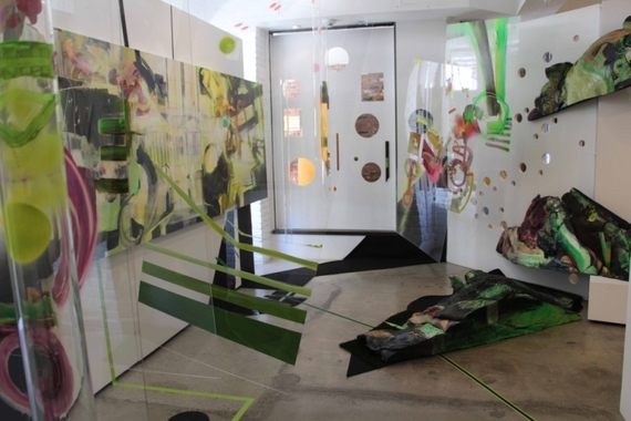
Yvette Gellis paints with such energy and ambition that the very boldness of her approach becomes its own raison d’être. Gellis does not simply capitalize on her own fervor, however, but puts it to work toward a yet more expansive end, the merger of painting and architecture. In this, Gellis reverses the usual relationship of the two disciplines; instead of employing painting as architectural embellishment, she puts architectural space at the service of painterly gesture. Her installation, filled with three-dimensional lines of force and broad two-dimensional strokes, ate up the small space allotted it and practically entrapped visitors – visually and spatially – in a welter of brittle, aggressive forms, both geometric and organic. The effect was at once discomfiting and exhilarating, as if one were being launched into space while still fastening one’s seatbelt. Gellis’s spatial design worked as much against as with the vigor of her forms, cutting them off in mid-flight, hanging as planar barriers to their trajectory, skewing our view of them by inviting us to spy on them through round and square apertures, and such – a risky aesthetic self-sabotage that sometimes compromised the dynamic of the whole, but other times added to the giddy turmoil. Gellis made a mess, but the mess was glorious, unpredictable and explosively loony at every turn, and, as one gradually came to realize, as logical as a building. (Garboushian, 427 N. Camden Dr., Beverly Hills. www.garboushian.com)
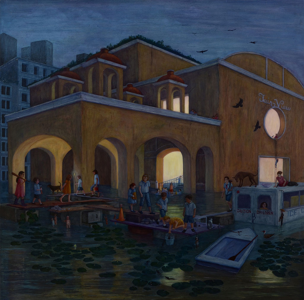
Siobhan McClure imagines an urban environment – Los Angeles’s, to judge by the references to Pasadena and other towns be-malled in a Spanish stucco fashion – that has been overtaken rapidly by myriad environmental upheavals. For one thing, water predominates, flooding most of the structures. For another, only children, and some animals, seem to have survived whatever catastrophe has befallen this region (and, one projects, the world). Lest this make McClure’s work sound like so much predictable “young-adult” science fiction (or video game fodder), it should be noted that she imbues her pictures and their inhabitants with a disarming dreaminess. The present weather is actually bucolic, as if LA’s climate has reasserted itself; the light is warm and lambent; and the activities of the (mostly) pre-adolescents seem reasoned, orderly, and unfazed by the precarious conditions – even when one of their number seems to meet with misfortune. In fact, a story does underlie McClure’s pictures, and the “tribes” she depicts have origins, separate identities, and sophisticated interfunctions. She even endows them with symbolic as well as theatrical resonance. But these details remain details; the storytelling happens entirely in the painting, even in the works on paper that feature object and figure studies, and the children and birds and dogs and buildings and things remain in a permanent – or perhaps suspended – state of becoming, of interacting, of managing. Their story is so full of past events that their future is impossible to project. Further, McClure’s style, at once sophisticated and simple, bridges a decorous naturalism (most reminiscent of mid-century English and American adaptations of surrealism) to children’s-book illustration, deliberately neutralizing whatever dramatic edge such imagery might be expected to assume. Just as her little people address their tasks and their world with startling equanimity, McClure finds the calm between the storms and poises the entire narrative in this delicious, untenable present. (101/Exhibit, 8920 Melrose Ave., W. Hollywood. www.101exhibit.com)
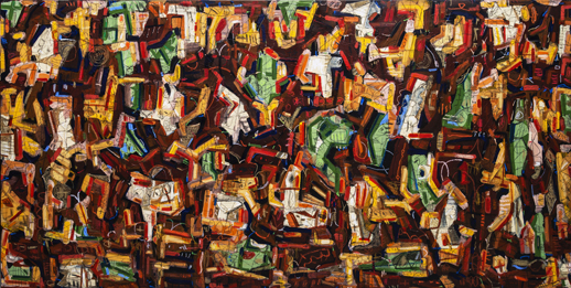
Gronk is best known for his participation in the Los Angeles-based Chicano performance/protest quartet ASCO in the 1970s and the iconic neo-expressionist figuration he practiced for two decades thereafter. But it could be argued that his best work is the busy, intricate, high-spirited (but darkly colored) abstraction to which he has dedicated himself in the last 15 or so years. This display was punctuated with one recent large, even dominating, rendition of La Tormenta, Gronk’s theatrical, all-in-black-with-her-back-to-us alter ego. But the other works in the show, all abstract, have also resulted from the artist’s indulgence of his theatrical side. For the past several years Gronk has been working with impresario Peter Sellars on an evolving, dance-rich production of Henry Purcell’s opera The Indian Queen (presented so far in Russia, Spain, and – next month – England). The large paintings and small, notational drawings alike have all resulted from the backdrops, mobile structures, and other designs – right down to a painted “floor” – Gronk has created for the production’s various iterations. Purcell set The Indian Queen in the colonial Americas, and Gronk’s excited calligraphy – rather choreographic in its own right – takes inspiration equally from Maya hieroglyphics and modern graffiti. This manifests expansively in Gronk’s big paintings and compactly in his small paintings and monoprints, the latter as vigorous as the large paintings but the former more contemplative and notational, rather like late Miros rendered in delicious earth tones. (Lora Schlesinger, Bergamot Station, 2525 Michigan Ave. #T3, S. Monica. www.loraschlesinger.com)
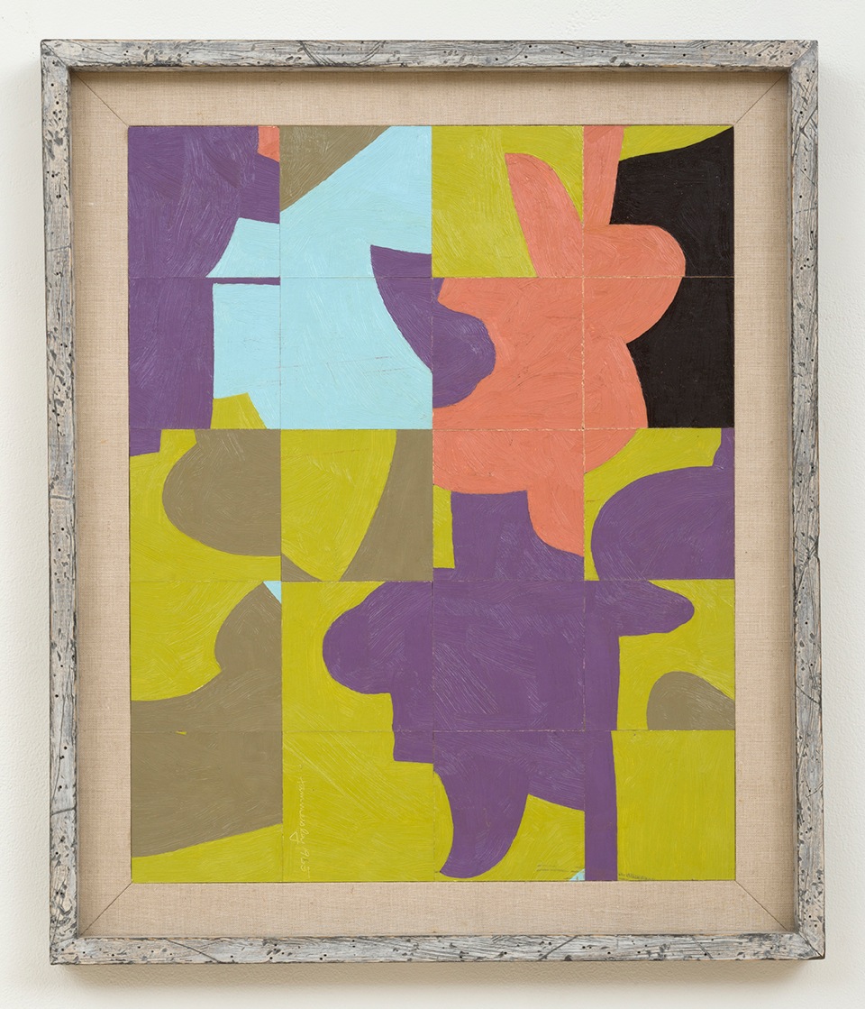
Frederick Hammersley‘s oeuvre is better known about than known; although its earmarks can be readily distinguished – fluid but clearly delineated areas of pure (or at least bright) color interlocked in relatively busy schemata – the variations Hammersley wrung from his characteristic formula were various and disparate. A case in point was his output from 1963-65, divided into two groups, the “Organics” and the “Cut-ups.” The Organics, easel-size paintings or smaller, pose rounded, irregular color areas against one another. The eccentric nature of these shapes, and the vividness of the color hark back to pre-war modernism, conjuring everything from Brancusi and Picasso to Miro, Arp, and Arthur Dove – and looking like none of them. They also anticipate Bill Jensen and Tom Nozkowski, among others, in their claim to a miniature, even miniaturized, abstract dynamic: had they been made much larger, they would be speaking directly to Ellsworth Kelly and Leon Polk Smith, but at their relatively intimate scale they seem at once more decorous and more vibrant, certainly hard-edge but not at all minimal. With the “Cut-ups” Hammersley aligned himself even more directly with European models of geometric painting, including the likes of Klee and Herbin. Neatly slicing up various decommissioned paintings into evenly-sized squares, Hammersley rearranged those squares into jazzy, angular fun-house reflections of his more normative style, putting the “cubism” back into his method more or less literally – to delightful, and often surprising, effect. Showing the two bodies of work together resulted in an almost startling double-faceted sense of the painter, here doing what he’s known for (with perhaps a broader palette and more fluid composition than at other times), there upending the whole shebang and treating us all to sometimes-riotous syncopation, rather like Rachmaninoff writing rags based on his own piano compositions. (LA Louver, 45 N. Venice Blvd., Venice. www.lalouver.com)
Source: http://www.huffingtonpost.com/peter-frank/haiku-reviews-art-2014-ro_1_b_6405380.html
By: Peter Frank